Xamarin in Action — Chapters 9 + 10
Welcome back! This post will be reviewing Chapters 9 and 10 of the book, which covers the first V in the MVVM architecture, the view. Specifically Android. Chapters 11 and 12 in the next post, will cover the views for iOS to round off Part 2 of the book and also means 2 working Android apps, woah!
The book touched on Android views slightly earlier on but this is where you will learn to understand them a bit more. There are two parts to a view on Android. The Activity which is the Google term for the full screen view and the actual UI. Layout files are where UI’s are usually defined rather than using code.
Section 1 Subsection 1 covers design, specifically Material Design. Google have developed something called Material Design which covers their design guidelines for optimising your views for all screen sizes and platforms. You will have seen this in action with Google Maps and Gmail for example. As Jim explains, there are three key concepts to this Material Design idea:
Material is a metaphor for what materials you would use and how you would interact if the app was a physical thing.
Bold, Graphical, Intentional — Any Android UI should be crisp, clean with a sensible and appealing colour scheme. It should also have an instinctive layout in so much as the user will instinctively know how to interact with buttons clear from the normal text for example.
Motion provides meaning — We know from years of web technologies that animations can be a nice way to ‘spice’ up a screen. With Material Design it stipulates that motion should provide meaning. So what does this mean? Well it means motion should be used to convey feedback to the user such as a spinning loading circle.
As mentioned earlier, you will have seen Material Design in action before and following these guidelines will lead to much more consistent and polished look to your Android apps.
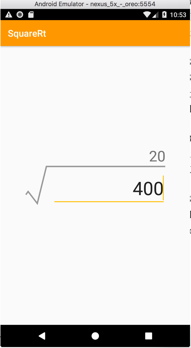
Subsection 2 moves on to the Layout file. As mentioned in a previous chapter, the layout file is a special XML syntax style page that defines components on the page and their attributes. In this section you start to build up the screens for SqrRt on Android.
Word of warning: In Visual Studio for Mac, the file type you want is called Layout. If you pick View it gives you a C# version.
Subsections 3 and 4 are brief but cover Resources and Resource locations. Resources are everything that is not code including Images and XML files for layouts, strings, colours and constants. Jim mentions in here something very useful if you are looking to port from Android to Xamarin with a project. Resources in both are identical so apart from changing the file extension for the layout XML files to .axml, everything will just work! As someone said in a video I watched recently “tada”.
There is also a convention on Android regarding where resource files live. Layouts always go in Resources\layout, Images in Resources\drawable for example. Jim puts a great table in which explains the different folders you can have in your Resources folder and what they are used for.
Subsection 5 covers a few topics including the layout file. Earlier in this section you created a new layout file, now you have two choices on how to edit this to build up your view; the designer view which is drag and drop style, or the source view which is the raw xml.
As you read through the subsection you learn about the different types of layout options you have to guide the layout and addition of new components. For example Linear Layout lays items out one after the other either vertically or horizontally whereas Relative Layout uses indicators and relative to attributes as it were to help guide where things go. You set layout rules to do this such as aligning to the top of the parent view or below a specific component such as a button. Components in Android are actually called Views (not to be confused with the View part of MVVM). There are things such as TextView(a label), EditText (a view for entering text) and many others.
The last bit you learn in Subsection 5 is about how Google has taken steps to make as many features as possible backwards compatible. This is a bigger issue than on iOS due to the nature of Android OS version distribution. Between various vendors and phone carriers wanting to add their own changes to the OS and apps available, there is a real variation on what is available so compatibility is really important to consider.
Section 2 is the start of the coding fun, actually making the Android layout for SquareRt. As we learned in the the last post, this will be very simple but it is a great start for learning how to make it. Jim gives the opportunity to use both the designer and the source code which is fantastic.
By the end of Section 2 you will have learned how Android deals with Images at different sizes, how to use the Designer and Source views to customise your UI including layout and added the 3 elements required for the SquareRt app.
Section 3 introduces the Activity part of the view. This is the part equivalent to the V in MVVM. You will get the opportunity to build up the view to add the toolbar and layout you created in Section 2.
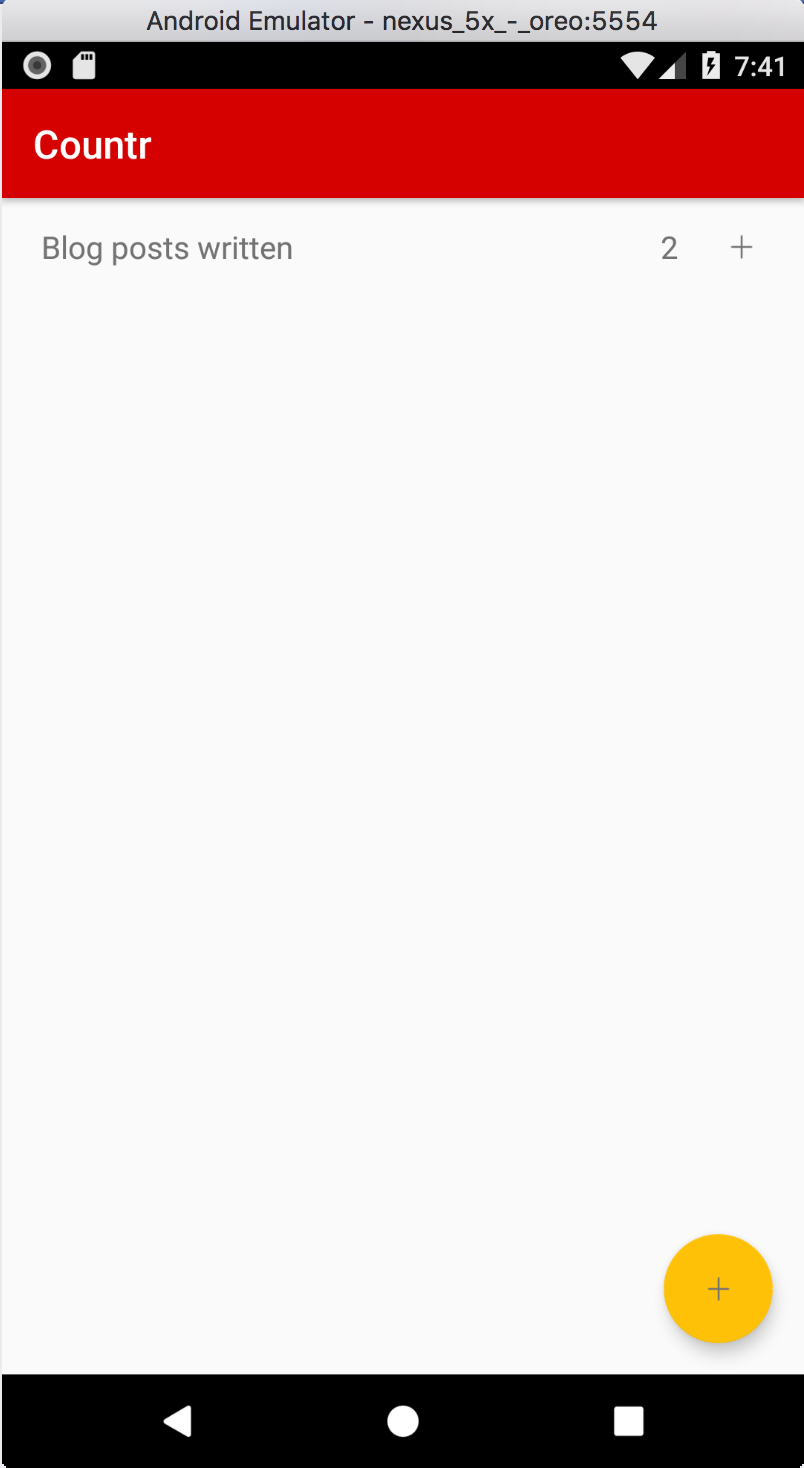
As is the pattern so far in this book, the more advanced views work will use Countr as the example application.
This will use the Master/Detail view idea which is two screens that feel a bit like one. The Master page will display a list of counters fetched from the data store. Section 1 talks you through beginning to build up this Master view. This includes learning about Recycler views in Android which are a more efficient way of displaying lists. They take a bit of work to consider but as we have learned from this book, MVVMCross has a habit of taking away the complication for us, hazaa!
MVVMCross does some of the configuration for you for what makes up a recycler view but you will still need to add this view to your UI, plus define a layout file for what each item in the list will look like. Subsection 3 helps you write this extra layout.
In Subsection 4 you get to add your first Floating Action Button for adding a new counter. This is a common UI component from the Material Design library that you see in things like Gmail for writing new emails. Just adding it alone made me feel like I can actually make semi-nice looking apps. Quite a feat!
Subsection 5 is all about the Detail view. This is the page for “add a new counter” and will contain elements such as the standard navigation back button, a done button for saving and a place to enter details about your exciting thing you want to count. Jim uses the visits to the gym in his example, oh how we could all do with more of that! I went today in fact so thankfully I can increase mine by 1 ;)
Menu items is the name of the game in Subsection 6, showing you how to have the Done option in the top right and how you can have menu’s like that in any app.
Section 1 complete, time for Section 2 and creating the Activities that will make use of those layouts.
Subsection 1 is easy enough, adding very similar code to what was used earlier in SquareRt. Subsection 2 covers the recycler view for the Master page. As mentioned before, they can take a bit of setup but Jim has you covered!
This introduces a quite complex to implement but simple gesture I touched on earlier, swipe to delete! This doesn’t have out of the box support with the Android-SDK to Xamarin bindings so you will implement this yourself, with help of course! It’s really not as scary as you might think, only a few simple lines of code.
Subsection 2 is the detail view activity. You will configure the back button to appear (it’s available out of the box just needs turning on). You will however have to configure what it does. This is where you learn about menu items and something in Android called options.
That’s it, Subsection 3 is about running your app. The code is all implemented now, congratulations! There is a nice little explanation Jim has added which explains what is happening when you launch the app and interact with it.
Section 3 is all about app icons and launch screens. You don’t want your app to have the default icon or launch screen, you want something unique that fits a sort of ‘brand’ for your app so users know what to look for in their list of apps just by looking for the icon. I know I look for specific app icons all the time like Whatsapp, Firefox and Twitter.
There are a few options for creating the app icon including websites that will take one large image and generate the correct size icons for you. Timesaver!
Google used to have opinions on Launch Screens but since Material Design came out they have set a common pattern for these. You create an Activity to be the MainLauncher activity. MVVMCross has one by default.
There are two parts to the default splash screen, a layout file with some text and then some extra content defined using styles. Styles in Android are defined using xml files found in the resources/values folder. There is one already defined for the Splash theme (application wide styling) which is just an image for the background and a config to hide the window bar. You can customise this as you wish.
Jim also teaches you about XML drawables which are XML based drawing instructions for an image, similar to vector based Images such as SVG. They are a good option for splash screens as unlike bitmap based Images such as PNG, they can scale for different screen aspect ratios. You will create an image that looks like the app icon but created using XML. Be aware that text is not supported by XML drawables so if you wanted to use text, you would have to create a bitmap image of the text you want to include.
The last part of Section 3 talks about styling the app by overriding the default colours used by Android. Wow guess what everyone? We have done it! Two working Android apps that use different features and customisations to make something awesome!
Next post, we will look at Chapters 11 and 12, the final two in Xamarin in Action Part 2. As mentioned previously, they will cover the screens for SquareRt and Countr on iOS. See you then!
